Login Page Redesign
(Proposal)
Value Proposition: Update the login site's design so that it is friendlier to new visitors who could be converted to potential leads if they knew more about the Fitch Connect platform
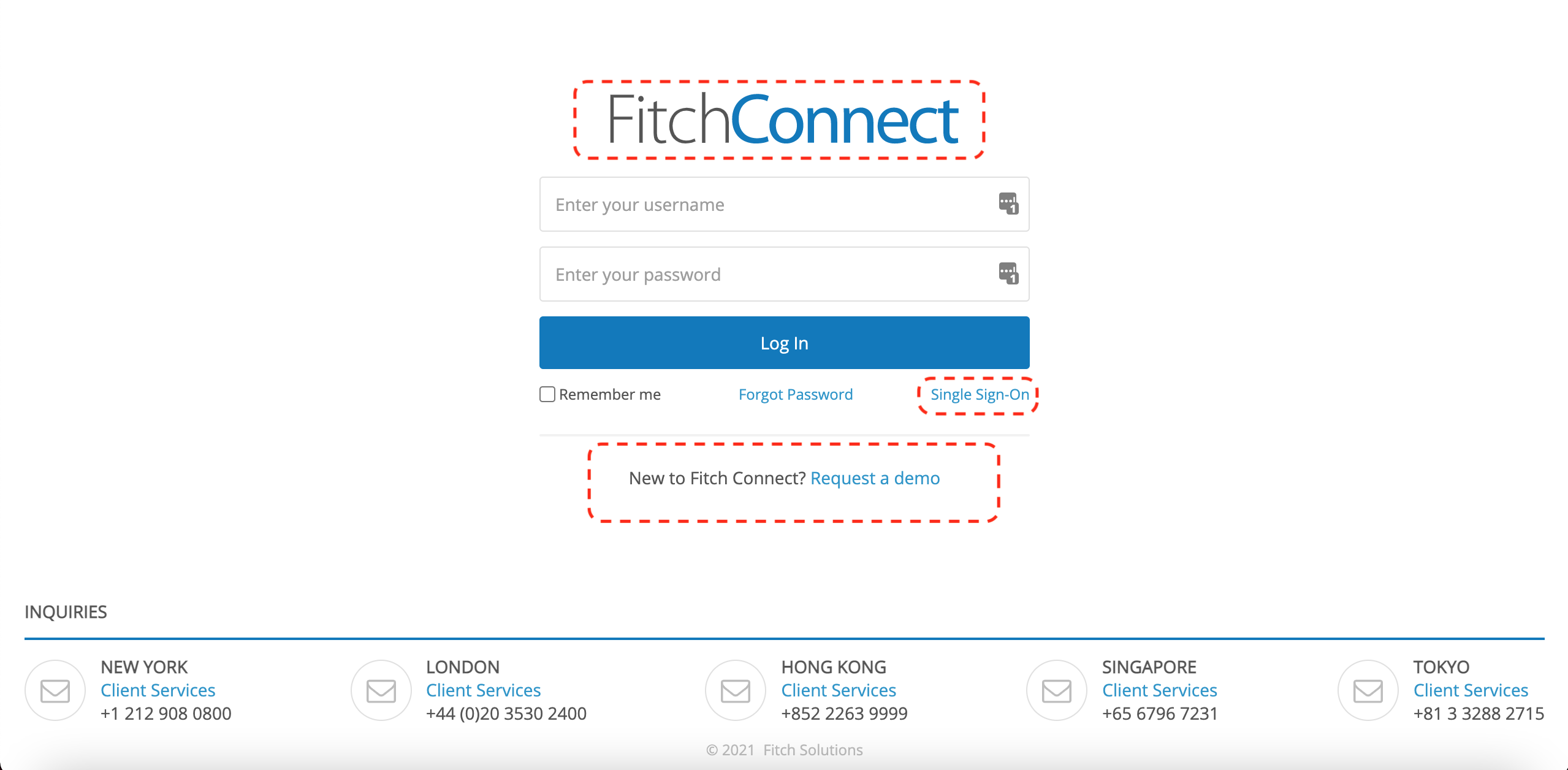
Current Design
- Old Colors being used
- Single sign-on login requires addtional steps and knowledge
- No context for none-subscribers landing on the login page from FitchRatings.com
- Little empahsis for converting visitors to leads
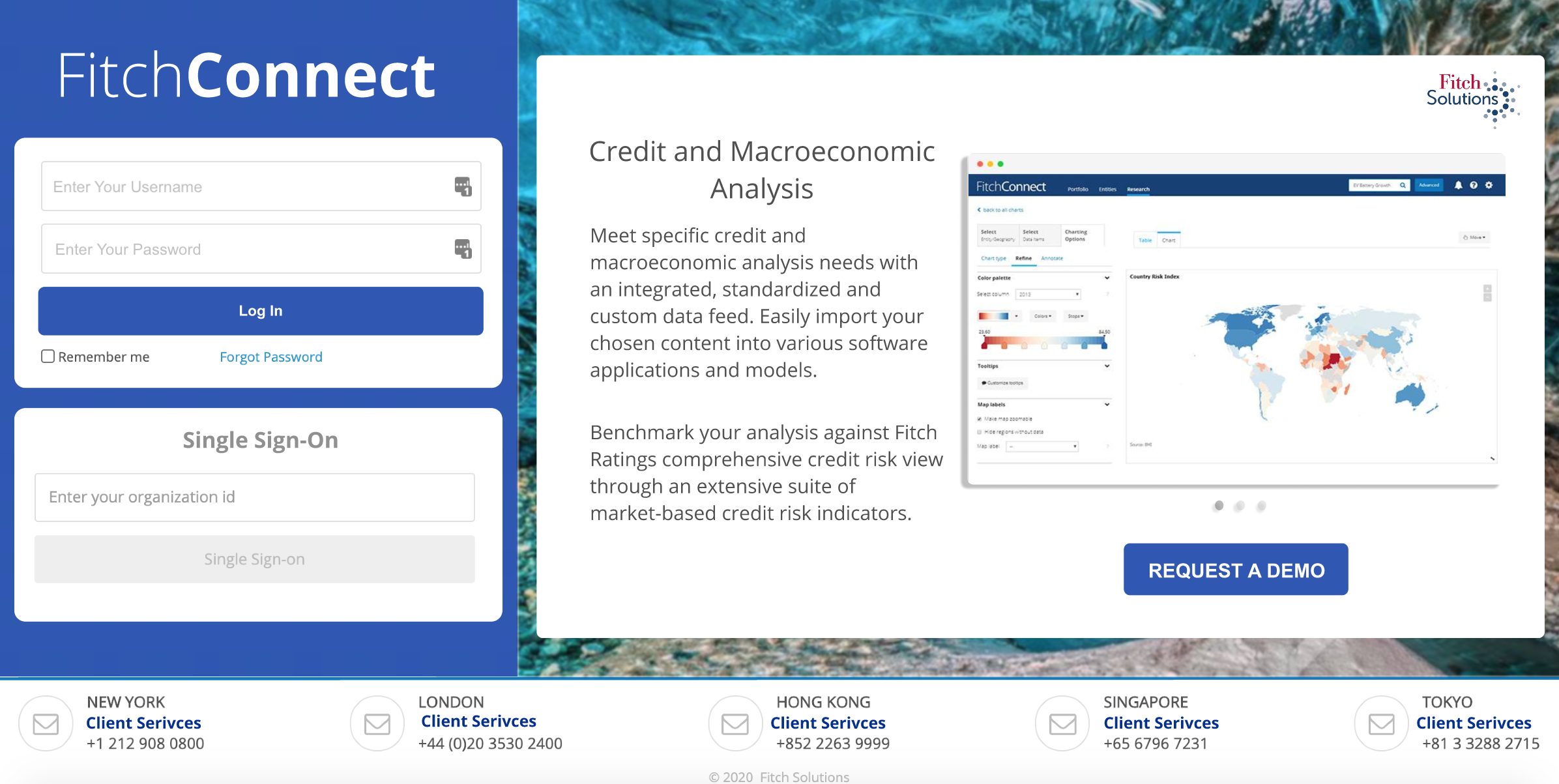
Proposed Design
- Updated color pallete that matches the Fitch Connect website
- Simplified flow for single sign-on login
- Increased space for marketing messaging which informs users about what the platform offers
- Increase in the size and change of placement for the "Request Demo" button so that visitors have an easier time being converted into leads